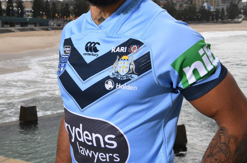
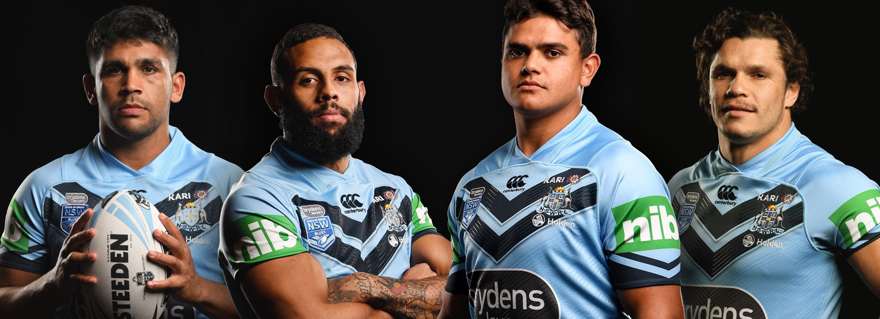
KARI are a leading community based organisation, whose main goals are focused on ensuring the Aboriginal community has access to culturally-specific foster care services, family support and education, as well as access to quality, holistic services.
“The Aboriginal people of Australia are part of the oldest continuous living culture in human history. Aboriginal people have a rich culture involving a custom, lore and value system based on the sustainability of their spiritual connection, belonging, obligation and responsibility to care for their land, their people and their environment."
BEFORE
AFTER
The new KARI brandmark is friendly and contemporary with a fresh colour palette that reflects the brand’s optimism for the future, whilst also retaining its heritage and homage to Aboriginal art. Bringing to life the new brand positioning, it provides numerous opportunities for the brand to connect with and engage the community.
Creating the KARI brand started by looking directly at what the organisation represented and how it wanted to position itself, whilst staying clear of ‘generic’ oft used options that simply wouldn’t create the desired differentiation.
A key component for focus and consideration was to create a solution that told a story, conveyed interest, solidity and a unique perspective. Taking an outwardly view toward the community at large and the relationship they form with KARI, a relationship that facilitates teamwork that achieves positive and rewarding outcomes.
INSIGHT
KARI has strong customer loyalty and community support. It was recognised for its fantastic services and initiatives but the brand did not look distinctive or professional.
A major part of their existence relies on the support, funding and sponsorship from the business community, however the old brand did not align to the vision of engaging large, multi-national companies, it lacked a refined and consistent presence. The new brand was developed with a defined strategy of how to engage and connect with the corporate sector.
Building on their service offerings we also uncovered a powerful and authentic story behind the brand, the meaning behind KARI and how it connects to the Aboriginal people and their connectivity to a natural landscape, a landscape from which many lives, stories, tales and art are born.
CHALLENGE
KARI was excelling in many ways but it just didn’t look the part. While the organisation had very high levels of community satisfaction and loyalty, the brand identity and communication was not reflecting this. It was struggling to stand out in a cluttered market, and in particular, attracting new people to become involved within its volunteering initiatives.
Their brand needed to stand for something distinctive and bold, in order to build a stronger emotional connection with their community.
STRATEGY
The KARI brand proposition is built around the community, it's needs and aspirations. The mantra of the brand champions how we want people to feel; supported and understood... 'Changing Lives. Keeping Culture.'
The brand was positioned to appeal not only to Aborignal's but the community at large, because every community relies on the people within it. Its about coming together as a collective to improve lives and create brighter futures.
NATIONAL RUGBY LEAGUE (NRL + NRLW) SPONSORSHIP


"I worked very closely with Chris at Watershed Brand Lab when we undertook a complete rebrand. Having initially underestimated the size of the project, Chris was extremely helpful in working with us to navigate the project – from assisting with general advice, to uniform design, to signage and suggesting internal and external roll out procedures. Chris also assisted with the creation of new marketing collateral across multiple programs as well as assisting with carrying across our new branding to our new website. We were often working to extremely tight deadlines and Chris was understanding, doing whatever was needed to to help us meet our often impossible timeframes.
The general reception of our new brand and subsequent marketing collateral has been phenomenal and really positioned us effectively in our space in terms of how we present ourselves and our programs to our clients and partners. We have seen enquiries double across multiple programs and this is a testament to how successful our new branding has been.
Thank you Watershed for helping us take this exciting new direction in our brand."
Mia Matheson - Marketing & Partnerships Manager - KARI